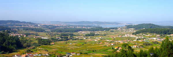
Bodegas Vionta (Rias Baixas) sports an impressive view (above). You can see that most of the vineyards in Val do Salnés are quite small, in fact the average size for all of Rias Baixas is .59 ha. There are 4,759 growers in this sub region alone! Groupe Freixenet purchased the property in 2012. It includes a state of the art winery, impressively landscaped gardens and a beautifully appointed reception centre. (Vionta is the name of a protected island off the cape in the distance.)
During our visit we were shown a new “lifestyle” wine: “You & Me” 2013 is a 100 percent Albariño, that sports floral notes and bright tropical fruit flavours, with a light juicy stone fruit palate. It makes for a perfect sipper or a good partner to gently spiced plates. Coming to a wine shop near you, soonish. 89 pts.
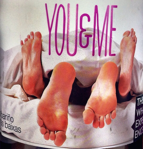
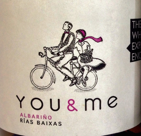
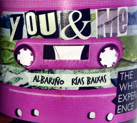
But that wasn’t the point. It was really about the packaging. You & Me comes bottled with three different labels. We were asked which we thought would be most appropriate for our respective markets.
I thought it kind of a fun exercise to share, so here are the labels…
Feet label
 I have to admit that I thought this concept is by now a little ‘tired’. After all, that whole feet up feet down thing goes back more than a few years. My guess is that this label would do well in private stores but I have a hunch that the government stores might have an issue with the label. Just a hunch, mind you. Though God knows why. (BTW that foot on the right isn’t really deformed. It’s just my photo…)
Bicycle label
 This is kind of cute, although somebody joked that Canadian monopolies would have a real problem with it—because they’re (gasp!) not wearing helmets. I thought it was a bit telling because the guy is “driving” and might be more fun if the gal was—and he was carrying the picnic. Just a thought. Good for their target market, which is stay at home couples and friends. And maybe this label would be really good for bicycle savvy Vancouver…
Cassette label
 This is the most fun and edgiest of the options. I did have to give it a second glance to see what it was—not a bad thing. But I do think it appeals to the younger drinker more than the other two. Unlikely to get lost on the shelf, which the ‘bicycle’ label likely would. Not so sure about “The White Experience” on all of these. But that’s probably going to change, which is a good thing.
What do you think?
Please comment below!

Love the bicycle label and I agree she should be driving it
Put a basket on the bike and her hands are free to point directions. Slap my hand for that comment! Truthfully , less on the label at our age the better we can see. Bicycle it is.
I’m all for the bicycle, with her pedalling and him carrying the basket. Please – dump “the white experience” asap!
I agree with Heather. You suggest No 3 is for younger drinkers but do you think they will actually know what it is suppose to be?
Hi Linda, Yes,you’re so right. We had that discussion at the winery. Guess I was thinking that the younger drinker might be drawn more to the colour and the funky rather than the cassette—which even I didn’t recognize at first!
I am also in agreement with the bicycle, a wider demographic can relate to it. I feel the cassette label could work better for a microbrewery.
They should most definitely get rid of “The White Experience”. Know what they’re trying to do, but it’s not working. As for the rest, I think the reception of each label will be dependent on the demographic – age, gender, past experiences – an immediate visceral reaction based on that. Personally, I prefer the bicycle. Think the cassette would work for a smaller demographic – those who used them and had cassette tapes made by for them – and only if they redrew it to be more nostalgic. Didn’t quite get it at first with the way it was presented.
Yup, I’m thinking the bicycle is a winner. Just seems a little bit close to some other bicycle labels already out there. But still nicely done. Not much ‘love’ for the feet …
The bicycle.
She drives.
He points!
Mix tape?! I’m all over it. Might be hard to take the wine seriously with that label…but, it certainly stands out. I think the bicycle label is the cutest – but yes, could get easily lost on the shelf. If it was a bit less traditional and a bit racier, it might catch the eye.
First label is a bit tired…but I wouldn’t have expected to see it on a wine. Maybe that’s enough for it to stand out?
Yeah the bike one appeals to me most, while the others do not convince me this could be a wine I’d enjoy. And very worried about White Experience tag line.